
This gallery has two purposes: To show the variety of maps I have produced to solve navigational and information challenges encountered by clients needing to contextualize their destinations and, using short project descriptions, to provide strategies for using maps in ways you may not have considered. As a bonus I've cited some experts who explain why context maps are valuable in today's digital age of individual road directions. Click on the maps to see a larger image.
Friday
Monday

Wednesday
This is an older map of the high desert town of Bend, Oregon. It is a recreationalists (is that a word) heaven with activities for every season. I wanted to feature not only the sponsoring businesses of the area but also the amenities of the surrounding outdoor highlights. Not shown here are the display ads and some editorial content of the opposite side that helps supplement the information shown on the illustrate map.

Sunday
This simplified graphic is used in a portable 3' X 6.8' vertical display by the Port of Skagit in Northern Washington. Most recently it was part of their presentation at the Seattle Boat Show to introduce attendees to the Puget Sound north of Seattle. For added interest I featured some of the things boaters are likely to see as they ply the waters of the sound including wildlife, lighthouses, and interesting other landmarks.

The Port of Skagit in Washington commissioned a two-sided folded visitors brochure featuring a series of four maps showing: A) the Port's location relative to the Puget Sound area, B) the relative locations of the various component venues within the Port of Skagit authority, C) a detail of the Port's business park and, D) a detail of the Port's marina facility.

Below is a 3 map series for a client in Georgia. As with the group of maps above, the goal of this two-sided piece is to allow the viewer to visually zoom in to the featured area while the wider ranging maps show the town in relationship to the surrounding areas including the entire Southwestern United States.

A Resort Hotel in Phoenix needed a detailed map of their water park to show visitors the various highlights within the facility. Generally I would suggest rendering such a destination a little on the whimsical side with exaggerated features and kids and adults having fun in and around the water but the request was for a more straight forward illustration of the grounds and it's not good to argue with the customer.

Tuesday


Sunday
British International School of New York
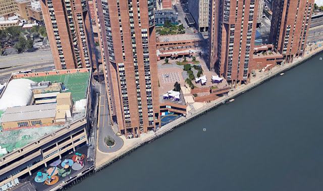
The urban campus located on the bank of the East River in Manhattan presented a few challenges in that it was buried beneath a series of high rise buildings (photo at bottom). The tall buildings needed to be taken out –but still hinted at– and some areas cutaway to reveal the actual locations of the campus facilities within the collection of other buildings. A number of students representing various learning and play activities at the school were added for whimsy and softening of the overpowering architecture. The campus illustration is shown without the labels used to identify the various features of the school.

Shown below as it appears on the organizations website with some labels and a legend

Saturday
In today's digital age why even create a handmade destination map?
"While digital maps are helpful in getting from "Point A" to "Point B," they lack topographic details and cultural landmarks, among other details. Paper maps show 'the big picture', whereas navigation systems only show direct routes and immediate surroundings. These shortages can lead to geographic illiteracy and dissipate our sense of direction."
Kayenta/Monument Valley, AZ


Kayenta (above) is the gateway to Monument Valley in Northeast AZ. They wanted a way to show the relationship of the town to the nearby tourist/recreationist destination. Of course, the valley is sprawling and if the distances were not compressed, the famous rock formations would go far into the background and be hard to see. When designing a map scene for a large geographic area it is important to cheat the reality a little in order to be visually representative. This is the beauty of a hand drawn map; the ability to use artistic license to create the proper "look" for the visitors to easily process.
Monday
"Paper maps decorate the walls of offices at Google Maps, and even the Director of Google Maps, Manik Gupta, goes out of his way to print out paper maps when he travels. They can be folded into his pocket and handed to taxi drivers. Bill Rankin, cartographer and Yale professor, says that there is something about having a paper map on the wall to look at."
The image below is a folded-style map I created that was flattened, laminated, and used as a 21" X 34" wall poster. It covers a large geographic area in central New Hampshire called the White Mountains. Eight small communities are shown in the scene as enlarged insets with businesses labeled for identification to visitors. This map was intentionally drawn with whimsical scenes of wildlife, recreation, and landmarks that are characteristic to the area. Sometimes things are hidden on the map. In this case, because the area is renowned for covered bridges, there are ten such bridges located around the map for viewers to try to find. When the audience interacts with the map more sponsors are seen and visual impressions increase. Hard copy maps are collected by many as keepsakes to help trigger an enjoyable memory.

The map features is a small community about 20 miles outside of a large metropolitan area. They have a variety of offerings for the tourists and needed a colorful way to show, at a glance, the wide range of activities available to draw visitors to their area.
This 11"X 17" two sided map (available in padded tear-sheets at a variety of local businesses and the visitor center and also in online digital form) features a large area map showing the extended countryside for context. The reverse side contains a directory of businesses – color coded by industry and cross referenced with coordinates located on the map's border, and a detail map of the core downtown area.


Below is a simplified map of an urban area showing the various neighborhood playgrounds around the city. The art was used as a double truck layout to accompany a recreation article in a local lifestyle magazine. The blank bubbles were used by the client to insert addresses and additional information about each playground depicted (second photo below).


A real estate company that services a neighborhood within the metropolitan area of Seattle wanted a visitor/newcomer map of the main business district in the vicinity of their office. It exaggerates size as it features the three-block commercial area in relationship to downtown Seattle, the Puget Sound, and some nearby neighborhoods and landmarks.

"Any decent edition of J.R.R Tolkien’s Lord of the Rings Trilogy also includes maps covering Frodo and his fellow traveller’s epic journey through Middle Earth.
More recently the practice was followed by George R. R. Martin’s epic fantasy series that spurred the very successful Game of Thrones TV series.
These great storytellers all realized the importance of how maps could help them in their story telling, to help readers understand complex events in a world unfamiliar to them."

Norfolk Virginia (above): It's an area loaded with history and things to do. I did not realize this in my younger years in the Navy when I spent a week in Norfolk aboard a visiting destroyer. In fact it was downright boring. But I had a chance to go back a couple decades later and a make a map (also of Virginia Beach, not shown) to let others know it's not a bad place to visit. This map had display advertising on the reverse side paid for by advertisers who wanted extra exposure. This map is also shown before labels were added as you see on most of the other maps.
Friday
Before and After
A resort and spa in the Phoenix area got by for a while with a simple diagram map. But over time it became obvious that is wasn't doing the job of either aiding visitors in getting around or showing the resort in the visually compelling way they wanted to communicate. So I helped create a better presentation for them.

Sometimes, as with this series of maps below created for a company that puts on races near national parks, the true value of the map is to draw people to the surrounding natural features. In these maps the race courses are only secondary to the surrounding natural environment. Therefore the majority of effort and attention was given to the landscape features that surrounds them as they participate in the race. They then had a visual memento to remind them of the event and keep their experience at the top of mind for the next race held by this vacation road race company at yet another stunningly beautiful venue. Many companies, especially in the hospitality industry, fail to consider the value of showcasing the surroundings of their properties as a big part of the marketing equation for booking reservations. My maps can integrate the properties into the surrounding environment giving a more complete presentation.


"Surprisingly enough, there’s a lot of academic research into the digital versus paper maps issue .Paul Clough, Senior Lecturer in the Information School at the University of Sheffield, conducted one of these studies and found that, aside from the fact that we still like paper versions of things (books, magazines), we trust paper maps more."
Monday
I endeavor to make maps entertaining, user-friendly, and informative to leave a stronger, more positive impression on the viewer than is possible with a typical diagram or Google-style road map. These illustrated maps have been used in many ways including online interactive programs (apps and widgets), incorporated into other printed marketing pieces, and even stand-alone displays in kiosks.

Feedback from project leader: "Thanks again for everything, you’ve been fabulous to work with, and your map is amazing."
I can work in different styles. In fact, if left to my own devices I will probably go a little overboard on whimsy and cartoonishness. For example. If you're presenting the opportunities for entertainment of a college town to incoming freshmen, it might be useful to make a poster that shows nothing but fanciful activities happening around the community. Such is the case with the group of businesses advertising on the piece below.

On the other hand, if your audience is going to be serious tourists who need to find their way around easily with information that is clearly presented, it would be more advisable to present the community with fewer distractive elements such as the sample shown below. Either way, the message can be tailored to appeal to the specific audience you wish to reach. And I can help in that process.

Speaking of the above La Conner map . . . if imitation is the highest form of flattery, I am indeed flattered by the organization that funded the creation of the map below. While it contains some different elements and a simplified style, it is obviously a direct tracing of the layout and major features of my earlier original. Moral of the story: If you want a nice map, don't go to the expense of having someone copy an existing map. While it may honor the original artist, it could make you look unimaginative. Have an original created to your own specifications instead.


I tend to think of my maps as "portraits" of a property that can also
be used to help people get around
The illustrated map above was made for a shopping guide for a facility in Kona, Hawaii. The back of the hard copy version contains a directory of businesses with more detailed information. It replaced a flat diagram-style online map of the area that could direct people around the property once they were there but had no ability to entice the viewer into visiting. This map serves both to promote the marketplace in a compelling way AND direct visitors around the property to the various merchants in print and digital formats. Maps, when approached creatively, can do more than one thing.
Actual quote by Coconut Grove Manager: "Wow. I really like it."

This USA map commissioned by the Land and Water Conservation Fund in DC is meant to convey the diversity of projects funded by the organization by illustrating a sampling of the familiar and not-so-familiar beneficiary venues and programs around the country.

The illustration became an interactive addition to the Wilderness Society website.
Comment from LWCF project leader: "We have started promoting! Thanks for the amazing work."
Trail map (below). Most major ski areas already have wonderful trail maps produced by the king of ski trail maps, James Niehues. I cannot compete with his legendary coverage within that market. But, there are times when a ski resort may want to do something different like a special co-op promotion with sponsors or show off the facility with a degree of whimsy that communicates the joy of skiing as the close up details of a ski resort poster shows (click image for larger view).


Speaking of ski resorts, this map of Mammoth Lakes, CA was commissioned by the Mammoth Mountain Ski Co. and used in their newcomer packet of information for visitors unfamiliar with the offerings of the local business community which would make their initial impression more enjoyable. The map includes many artistic embellishments that show the recreational activities of the area. To create more interest in the map, numerous black bears were "hidden" within the illustration as a type of game to get viewers to scan the map in more detail. You can see the game announced in the lower right corner next to the large bear.

Tuesday

A facilities map commissioned by an East Coast retirement community included an overview map of the entire property (above) and a detailed map of the interior of the common buildings (below)

Developers sometimes have only aerial diagrams or architectural floor plans to help them sell a project to prospective investors. One developer I've worked with decided to make his proposed multi-unit development come alive with a colorful rendering of the property (below) as it would look after all the work was completed. It worked. Investors wrote checks and the project became reality.

In response to a developer's request to show an abandoned lumber mill site repurposed for low and high-density housing, retail, restaurant, and recreational uses, I came up with this sketchy watercolor rendering showing these potential uses in a way that would interest prospective investors. My illustration includes an old sepia tone historical photo of the mill juxtaposed with a color rendering of the property with somewhat exaggerated representations of the various elements it could contain.
Investors are sometimes notoriously laking in imagination. Some of my clients have therefore found it valuable to help paint a picture . . . literally . . . of the potential uses for a bare piece of property when presenting plans. Diagrams and plot plans sometimes just don't tell a compelling enough story.

Wednesday


On the reverse side of the Fairgrounds map is a view of the Syracuse vicinity showing points of interest, local activities, and the advertisers who paid for the map. Although not shown here, both maps are surrounded by display ads for fair sponsors and local advertisers.
But what if the area covered by a map changes in a few years? Must a new map be made at great expense? No. As the New York Fairground leadership discovered a couple years after I made the first map (above), when changes are made to the landscape, those changes can be easily, and inexpensively patched into the original image as shown below.

View the newest map on the organization's website: https://nysfair.ny.gov/your-visit/maps/
A Map for all Seasons
I like this map because of it's economy and versatility for the client. The client is a New England resort that caters to guests during all seasons of the year but requires somewhat different maps for different seasonal visitors. The map itself is very simple and didn't require extensive illustrative input. What is different and efficient is that one art file containing several graphic layers allows the client to show the resort with different seasonal looks and highlights. By simply clicking a tab the map changes from a summer season look to a winter look and highlights the trail system.

The basic map shows the resort and trail system in a spring/summer appearance.

Activating another layer highlights the color coded trail system. Note this map is shown in its basic illustrated form before labels and other graphics were added.

Activating another layer on the same art file shows the resort in its winter attire. With this solution the client can print, on demand, the map that applies to the specific needs of the guests. It's a three-in-one map for the price of maybe 1 1/2 maps
Quote from VP of Marketing: "These things fly off the shelves during hiking and snowshoeing season."

Subscribe to:
Posts (Atom)